Free Membership Rewards

Role
Content Design, Product Design, User Research
Duration
1 year/ongoing
Tools
User Zoom, Figma
Team
UXR Team, Creative Teams, Digital Experience Team
Overview
Kroger savings program rewards customers the more they shop with them. There are two main ways to save with Kroger—A paid Boost Membership as well as a Free Membership. Throughout this project I worked to help streamline information presented to users and to drive new user sign ups to the program.
Insight into how effective the Free Membership site experience page is at driving digital account sign ups and app downloads.
Objective
-
Are customers clear on how to sign up for a digital account after viewing this page?
-
Does the Free Membership page motivate customers to sign up for a digital accountor download our app?
-
Do they understand the benefits of signing up for a digital account?
-
Is the benefit copy language clear to customers?
-
Is there information that is missing from this page that customers had to search for elsewhere to decide if they wanted to sign up for a digital account?
-
Which of the benefits is most motivating (to sign up for a digital account) to customers?
Key Insights to Find
Methodology
Unmoderated Testing
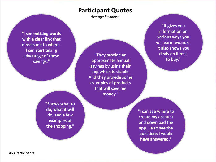
To first gain scope of potential issues with the landing page, we conducted testing with a total of 436 participants. Respondents were survey and asked to perform key tasks using UserZoom. We provided a visual of the recently updated Free Membership Site prompting them to complete tasks as well as give their overall impressions and feelings of the experience.
Testing Results
Q1. Are customers clear on how to sign up for a digital account after viewing this page?

-
While performing the click test task customers found multiple ways to sign up for the FREE Membership program.
-
Majority of participants were able to identify how to enroll in the program in less than 30 seconds of spending time with the page.
-
Several enrollment opportunities are above the fold and respondents were able to locate even the ones below the fold.
Participants overwhelmingly responded that they felt that the experience was clear and provided enough information to sign up for a digital account.
Key Insights
Q2. Does the Free Membership page motivate customers to sign up for a digital account or download our app?
-
Clear visuals and the information simply laid out participants felt it would be and FREE and easy program to sign up for.
-
Participants liked the personalized offers and exclusive savings the page mentions
-
Participants understood that they could save even more money with the Kroger App
Participants felt that if they signed up the FREE Membership program, they would be able to save right away .
Q3. Do customers believe it is easy to sign up for a digital account or download the app from this page?

-
Majority of participants were able to identify where to download the app in less than 20 seconds of spending time with the page.
-
While this task was further down in the experience participants were able to find how to download, although some clicked on the sign up account module.
Over half of the participants were able to locate where they could download the Kroger mobile app.
Q4. Which of the benefits is most motivating (to sign up for a digital account) to customers? Are the benefits that are featured on the page relevant to customers?
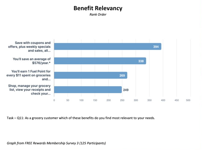
Participants found annual savings motivating information as well as exclusive savings and personalized offers.
Q5. Is there information that is missing from this page that customers had to search for elsewhere to decide if they wanted to sign up for a digital account?

-
Some participants were confused by some of the differences in language of the loyalty program (Rewards vs Membership vs Boost).
Majority of the participants felt there wasn't missing information from this program that would stop them from signing up.
Testing Takeaways
Altough stakeholders have access to the results of this test, it can be overwhelming to understand what this all means. To better fram the study findings I created an empthy map of the data to serve as north store for the testing results as well as some items to improve upon the pre-existing experience.

-
Lead with savings and offers that users will receive from signing up.
-
Information may take a bit to dig out, can it be presented in a more scannable/efficient manner?
-
What does the sign-up process entail?
From the testing feedback I suggest a few ways to improve upon the experience including:
Exploration
Gamifying The Sign-up Flow
Mid 2023 Kroger ultimetly decided to sunset its printed circular Weekly Ad advertisements. This move meant the Weekly Ad had to move completly digital by 2024—this decision would save the destruction of forests for printed materials and promote Kroger's initiative to become a zero-waste company.
To help drive sign-up from previous paper Weekly Ad shoppers to new-app users a new savings program was piloted. The previous paper ad shoppers would be re-directed to the Free Membership page to create a loyalty account. During this time an exclusive savings program would give new membership shoppers complimentary fuel points after creating an account.
The goal of this project was to gamify the sign-up flow and try to capture as much user data as possible durign the process. I worked with our creative director to imagine a gamified concept for sign-up that would communicate this new savings oppotunity and improve upin the previous experience.
Before
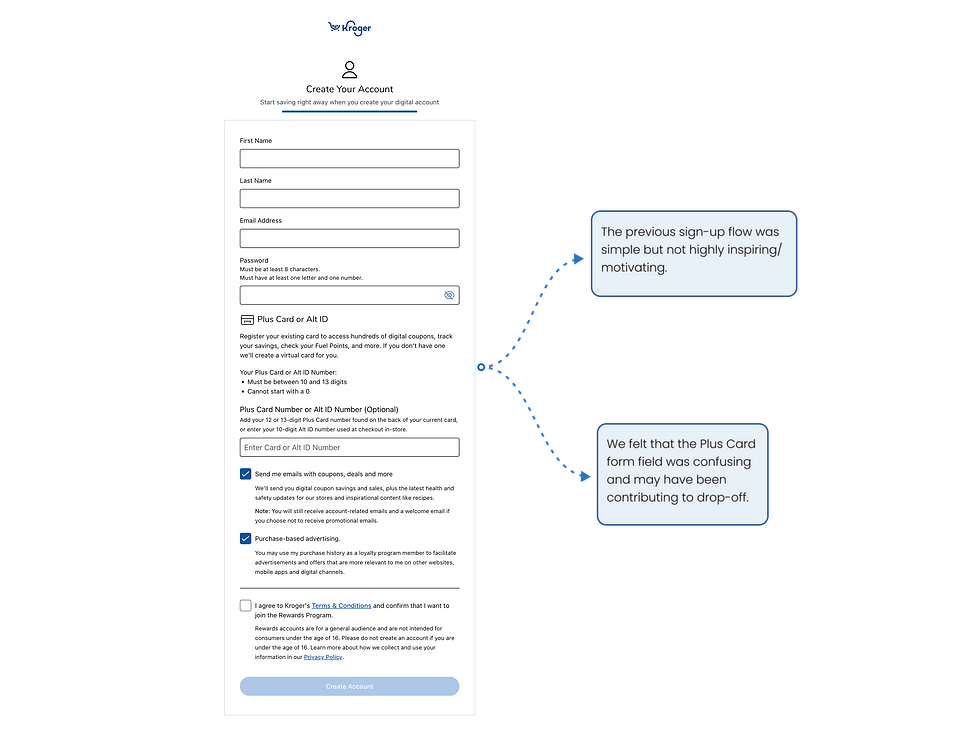
Above is what users were being directed to and the experience which that we set out to imporve upon.
After
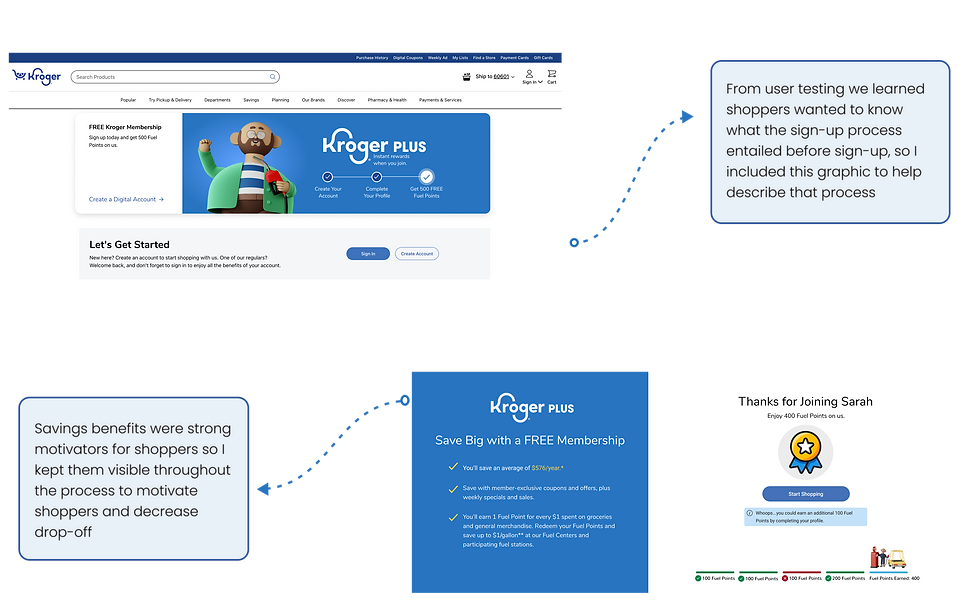
To gamify this experience I split the form into a pagianted flow—making each page an opportunity to earn fuel points. Below each step are progress tabs showing users where there are in the process and how many points they have received for completeing each step.
In the prototype you will see the UI of a red progress tab that shows what happens when a user does not fully complete a step in the process. The last slide then awards the user for the steps they have completed and prompts them to complete their full profile to receive the max number of fuel points.
Naming Convention
Content Design Testing
One insight from user testing that we picked out as a major point of concern was confusion as to what the savings program was actually called. This was something we wanted to take a closer look at through another unmoderated user test.
The current page was using many different terms to refer to our savings programs (Loyalty Program, Rewards Program, Free Membership, Boost Membership, Kroger Plus). Moving foreward we wanted to align on a consitent naming convention that resonated best with users expectations.
Defining The Problem
Stakeholder Interviews
We first met with the Digital Experience Coordinator who was in charge of thise page to better udnerstand the needs from the test. From that meeting we nailed down two main items to focus on:
-
Determine which naming convention resonates highest with customers
-
How can we help customers understand that a Loyalty Account is both a Shoppers Card and a Digital Account
Testing Results
Q1.
A store you commonly shop at is creating a new opportunity to help its most frequent customers
save money and gain access to exclusive deals. The new offering is free to join and can be used for in-store or online purchases.
What terminology would you use to describe what the store is offering?
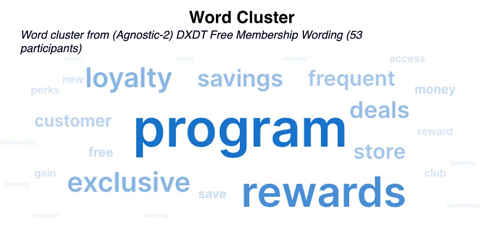
Participants included the term "program" within their term responses, typically preceded by the second tier words seen in the word cluster.
Key Insights
Q2.
What does your current grocery store call their savings opportunity that they offer to customers?

This question was meant to understand users pre-conceived notions of what grocery store savings programs are referred to as.
Q3.
Shoppers were asked to select all options they thought would apply to the naming conventions presented in the left column.

This matrix was utilized to better understant shoppers notions behind what certain savings programs were either free/paid and used online or in-store.

The matrix yielded valubale insights into how users thought of these different naming conventions when placed side by side. Helping us to udnerstand that "Memberhsip" is more commonly associated with a paid program.
Q4.
What program do you think provides the most opportunity for savings?

Shoppers overall belived the term "Rewards" in a program will is most synonymous with savings.

Rewards proved to be strongest in value for shoppers looking for savings programs.
Segmenting Kroger Shoppers
Things to Consider
Findings
A review of what we found after user testing
-
"Rewards" resonates highest with a broader audience when communicating a shopping savings program
-
"Loyalty" resonates higher in familiarity with Kroger Brand Shoppers
Considerations
Based on user feedback a made a couple suggestions to move forewards with below.
-
Consider naming conventions of ("Loyalty Rewards Program", "Free Kroger Rewards", etc) to appeal to the larger audience.
-
Consider utilizing the term "Membership" exclusively for Boost since it is a paid program, and a slight trend that non-Kroger brand shoppers identify "Membership" with a paid program.
Takeaways
Project Learnings
This project really allowed me to dive deeper with experience into user research and formulating questionaires. I learned how to better phrase questions that are not too descriptive as to not lead test takers to a suggested response.
This project also allowed me to really get to them bottom of users thoughts and frustrations and use those as a foundation for improvements.
Next Steps
-
Continue to tweak/test content on this page to drive sign-ups
-
further nail down a naming convention that resonates best with users and utilize that in a consistent manner across the experience
-
further nail down a naming convention that resonates best with users and utilize that in a consistent manner across the experience
Lets connect!

© 2023 by Name of Site. Created on Editor X.